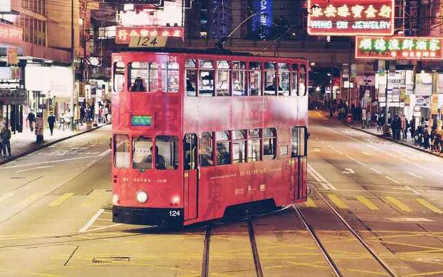
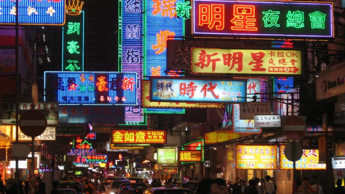
Signage is the most public form of graphic design. It has to be legible at speed, survive weather and communicate with people who never asked to read it.
Look up, then look closer
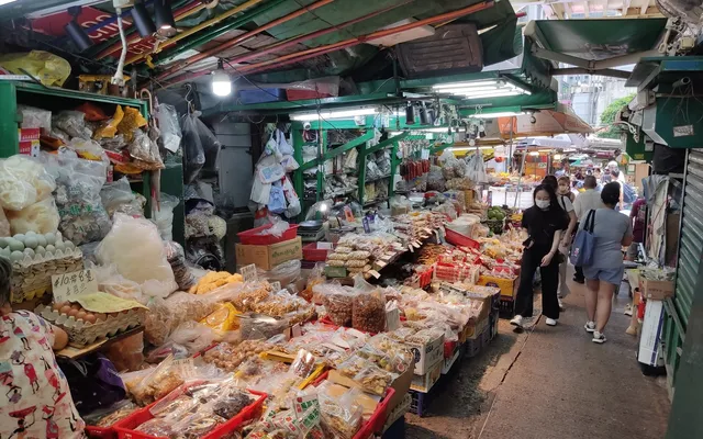
Walking a single street slowly reveals layers: official wayfinding with strict typography, older shop signs painted by hand, and temporary notices taped to doors.
A street's typography is a timeline if you know how to read it.
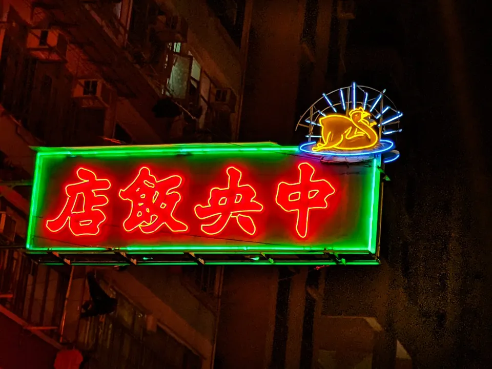
None of these layers is more authentic than the others. Together they are a record of how a neighbourhood has changed, and who has had a say in that change.